Facing Type: A Tour of the Court of Appeals’ List of Suggested Fonts for Briefs
By John Grimm
The Daily Record recently informed me that the Governor’s stay at home order has left appellate lawyers “generally unscathed.”[1] “Indeed,” I thought to myself, while downstairs my eleven-month-old patiently waited a full workday as I edited a brief. Actually, working from home has left at least this appellate lawyer a bit scathed, so I’ve had little time to study the appellate news lately. And what news there is seems to be all about courts’ new emergency procedures anyway, so in this post, I am going to address a topic that is irrelevant to current events, but which is a preoccupation for many appellate lawyers: typography.
One of the pleasures of appellate practice is that in addition to legal reasoning, it places great emphasis on the aesthetics of the written page. Many appellate courts allow you to write your brief in a font of your choice (at least within limits), and font choice can form an important part of your own personal brief-writing style. But with great power comes great responsibility, and selecting a font is perhaps the only area where I think lawyers should err on the side of boring their audience. I used to rebel against banal Times New Roman, but have come to consider it a sharp and professional font. But some people prefer a bit more elegance and class, and there are a lot of great options to make your brief look less like a dry legal document and more like a literary text—which is something all good appellate briefs try to emulate.
Maryland lawyers have a helpful tool for selecting a font for their brief: the Court of Appeals publishes a list of pre-approved fonts.[2] They’re optional, but apparently any font on the list is allowed for your brief. Some of these are classics and some are puzzling inclusions. I’ve spent a lot of time thinking about fonts and what I want my briefs to look like. So, in what will hopefully be equal parts useful brief-writing tips and mindless distraction, here is my review of each font on the Court’s list.[3]

As a general rule, I find sans-serif fonts[4] to be too casual for legal writing, but this will be a boring post if I repeat myself for every one of those fonts on the list. So with the general caveat that I find sans-serif fonts too casual for legal writing but that many respectable lawyers write perfectly professional briefs in them, here is my review of Antique Olive: you could do worse—it’s kind of stylistic and eye-catching.
 |
It’s hard for me to imagine making a legal argument in this font, however. It’s heavy and a little distractingly stylized for my taste. And although it was designed in the 1960s, something about the shapes of its letters and how they taper toward the bottom reminds me of art nouveau lettering used for the Paris metro.
 |
If you would like to evoke the Belle Epoque in your brief, consider this font.

Arial is a near-clone of Helvetica, one of the most ubiquitous fonts in the world, so I’m going to review Helvetica instead.[5] It was designed in 1957 by Swiss typographers Edouard Hoffman and Max Miedinger, and quickly became the darling of a generation of mid-century designers.[6] Helvetica graces a surprising array of corporate logos and is the official font of the New York Subway. If you would like your brief to look like the New York Subway, consider writing it in Helvetica.
The problem I have with Helvetica is not actually its repertoire, but readability. Its lines are thick and square, and I feel like long passages written in this font hit me like a wall of text. I’ve read a number of briefs written in Helvetica or Ariel, and they always feel like slogging through molasses. Consider:
 |
Did you get through that? Helvetica is a great font for logos and signs but I feel like it’s too much work to get finish a paragraph written in it. If you want a sans-serif font, there are some lighter alternatives on the list.

Okay, this is better than Arial/Helvetica, but it’s still too heavy for my preference:
 |
The whole brief feels like it’s in boldface. Plus, the roundedness reminds me of the Dunkin’ Donuts logo. Google it, and then decide if it’s what you want your court filing to look like.

These aren’t the same font, but they’re pretty similar looking and I pretty much have the same thing to say about both. They are both classy and elegant fonts, reminiscent of Garamond,[7] which is not on the Court’s list of approved fonts (but which I am sure would not get your brief bounced).
|
Book Antiqua: |
 |
| Bookman Old Style: |
 |
These are the kinds of fonts you could typeset a novel in, and I actually think that can be a good quality. A good brief probably won’t win the National Book Award, but since novels are something people read for fun, and since you want your reader to actually read (and maybe even enjoy) your brief, using a font that is well suited to literary works can help make your brief easy on the eye and a little less impenetrable.

I like this font:
 |
As sans-serif fonts go, it’s a lot more elegant than Helvetica. I don’t think I’d use it in a brief, though for one reason in particular: this is the font Weezer uses on all their album covers, and I can’t break the association. If you really want your brief to rock, though, maybe that’s a good thing.

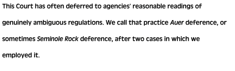
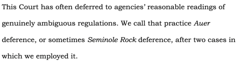
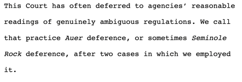
A mainstay of appellate briefs, Century Schoolbook is a solid and prestigious font that is just as professional as Times New Roman, but with a subtle charm and sophistication. I think this font derives a significant amount of cachet from its association with Supreme Court papers, which is perhaps why it is a favorite among appellate lawyers. (I rarely see it in trial briefs.) My hesitation with using this font in non-Supreme Court briefs is that, while its looseness and openness make it highly readable in the narrow-margined single-spaced world of Supreme Court briefing, it starts to look too loose and open in the double-spaced 14‑point world of federal court of appeals briefs. The following passage looks crisp and tight without too much white space:
 |
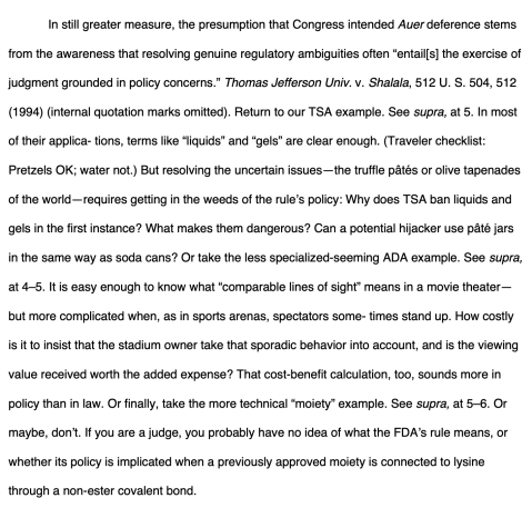
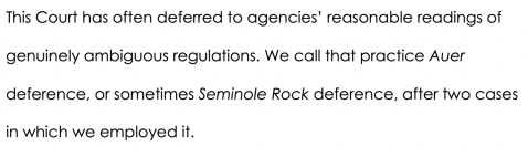
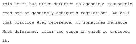
But with wider margins and at a larger size, I think it starts to look a little too airy:
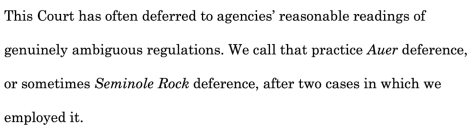 |
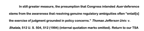
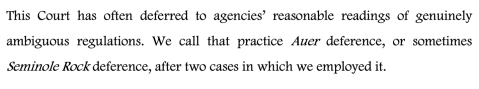
I feel like I almost have to move my head from side to side to read each word. Even with the spacing requirements of the Federal Rules of Appellate Procedure, the same passage looks tighter and more readable in Times New Roman. It also takes two fewer lines to say the same thing:
 |
The spacing issue is even worse if you use fully justified margins. The combination of large characters and a large font size leads to really inconsistent spacing between words, so much so that it becomes a distraction for me. Still, this is a relatively minor gripe and nothing looks great in 14-point double-spaced type. Century Schoolbook is an excellent font. If you want your brief to look sophisticated and erudite, use it with confidence.

I’ve never heard of this font, and it’s not on my computer, even with the hundreds of additional fonts that come with my Adobe Creative Cloud subscription. So I can’t review it. But based on a Google search, it looks a lot like Times New Roman. If you can find this elusive font, you should write a brief in it just to say you did.

Some people still use Courier for their legal documents, and it used to be standard for legal writing. I consider it a scourge that our profession is nearly rid of. Others may have a more moderate view.
| Courier: |
 |
| Courier New: |
 |
The one place I still see Courier New used all the time is in trial transcripts, which has never improved the processes of reading a trial transcript. These fonts have a couple problems. The first is I think they’re unattractive and dated. Courier looks like it was it created in the 1950s to be used in old electric typewriters—because it was.[8]
The second (related) problem is that Courier is a monospaced font, which means that each character is the same width. This leads to some awkward shapes. Look how wide the lowercase i is, and how the period is kind of uncomfortably distant from the last letter of a sentence, especially in Courier New.
Monospaced fonts were an expedient in the typewriter era, when the physical size of the letters had to be the same for mechanical reasons, but in the era of word-processors, they are unnecessary for most uses.
Courier is certainly a straight-laced and serious font. But I actually think using a typewriter font makes a brief look less polished and more rough around the edges, which detracts from its overall seriousness. To me, Courier is a font designed to highlight how much better your brief would look in a different font.[9]

According to Microsoft, Footlight MT “is an informal, yet lively and elegant typeface” named for “the theatrical sparkle it imparts to the text set in it.”[10] I will choose not to use this font, because I do not want my brief to have theatrical sparkle and I do not want to read 14,000 words that look like this:
 |

This is an interesting font:
 |
In small doses it looks minimalist and modern to me, but a full page of it starts to look like an old-fashioned computer screen. That makes sense because it’s also a monospaced font, which means it’s well suited to technical displays where you want data in each column to line up. According to Wikipedia, it was created between 1956 and 1962 and was originally intended to be used in IBM Selectric typewriters.[11] (I’m not sure if it took six years to design this font, or if modern font-dating techniques are imprecise.) I guess if you are determined to write your brief in a monospaced font, Letter Gothic is better than Courier. But the more I think about it, the more this font reminds me of an old ATM—the kind with the black and green screen. Since I specifically dislike anything that makes my brief look like it was prepared on a typewriter, I will avoid Letter Gothic.

Times New Roman will never dazzle your reader but it will probably never upset your reader. I use it because it is safe and reliable and after years and years I’ve come to associate it with legal writing.

How did this get on the Court’s list? It took a lot of work for me to track down this font, which is apparently considered a jewel of Bauhaus design, and does not have any uppercase characters.[12] I do not recommend writing your brief in a font without uppercase characters. Universal reminds me of a lowercase version of NASA’s soon-to-be-un-retired “worm” logo.[13] I honestly think whoever wrote this list meant to include Univers, a close-relative of Helvetica, and Universal got there by mistake. If you somehow have access to Universal, don’t use it in your brief. You can even use Courier instead.
In Sum…
Picking a font can seem like a trivial detail, and it’s true that things like reviewing the trial record and researching the legal issues are more important to your appeal than typesetting a page, but I think it’s both interesting and important to develop a coherent visual style for legal writing. And while there aren’t actually right and wrong fonts (except Courier), the choice should be made deliberately because different fonts say different things, and (if this post proves anything), affect the reader in different and sometimes unexpected ways. A good font elevates your writing, inviting the reader in, without stealing the show, and I think the whole profession benefits when lawyers take an interest in the aesthetic impact of their writing.[14]
[1] https://thedailyrecord.com/2020/03/31/stay-at-home-order-leaves-appellate-counsel-generally-unscathed/
[2] https://mdcourts.gov/coappeals/filingbriefs.
[3] The sample text used throughout is pulled from the Supreme Court’s slip opinion in Kaisor v. Wilke, 139 S. Ct. 2400 (2019), which gives me an excuse to plug one of my earlier blog posts: https://mdappblog.com/2019/07/24/kisor-v-wilkie-and-the-next-chapter-in-administrative-deference/. The images of different fonts in use were originally set in 14-point double-spaced type, as required by the Federal Rules. Each font name is displayed in the font itself, except where I could not locate the font, in which case it appears with an asterisk (*) and in Times New Roman.
[4] If you don’t know this term, a “serif” is the “thingy” on the ends of lines in some fonts. Or, more specifically, “A crossing feature at the end of the principal character strokes of certain typefaces” which “aid in character recognition and also have a decorative quality.” James Felici, The Complete Manual of Typography at 318 (2003). A sans-serif font’s “strokes end in blunt terminals, lacking the flared forms known as serifs” and these fonts “have little if any contrast between thick and thin strokes.” Id.
[5] Helvetica was actually the subject of a genuinely fascinating 2007 documentary called “Helvetica.” https://en.wikipedia.org/wiki/Helvetica_(film)
[6] Simon Garfield, Just My Type, Gotham Books (2010).
[7] Garamond is also a great font that makes briefs look lovely. One of the big reasons I don’t use it is that I think its italic characters are awkwardly proportioned, so it causes legal citations to look off to me.
[8] https://www.prepressure.com/fonts/interesting/courier.
[9] In 2004, the US State Department officially required Times New Roman to replace Courier New on most documents because in 14-point, it “takes up almost exactly the same area on the page as Courier New 12, while offering a crisper, cleaner, more modern look.” Garfield at 315.
[10] https://docs.microsoft.com/en-us/typography/font-list/footlight-mt
[11] https://en.wikipedia.org/wiki/Letter_Gothic.
[12] http://www.designhistory.org/Avant_Garde_pages/BauhausType.html.
[13] https://www.nytimes.com/2020/04/08/science/nasa-logo-worm-spacex.html.
[14] If you want to see some more detailed discussions about typographical principles and suggestions about how to typeset your briefs, check out the website and book “Typography for Lawyers.” https://typographyforlawyers.com.
11 responses to “Facing Type: A Tour of the Court of Appeals’ List of Suggested Fonts for Briefs”
Trackbacks / Pingbacks
- - August 9, 2023
- - August 12, 2025
- - August 20, 2025


I enjoyed your post and its occasional dry humor.
Thank you!
What are your thoughts on Garamond? I think it is the best font.
To follow up on my comment, it has been estimated that switching to Garamond could save the federal government hundreds of millions of dollars per year in printing costs. Because it is a smaller font.
Also, great and very thoughtful post.
Tremendous observations. In vein has it been queried to require requiring the use, in all electronic copies of briefs, decisions, and other filings, mandating a format using white or grey text set against a black background? Over time, such a wise decision could save many watts of electricity!!!
Good Post. I like having a choice of fonts, even though I always pick Times New Roman, except for USSC, which for most part requires Century Schoolbook-style fonts. (Apparently the difference with CG Times, is the capital T…which explains why it’s not important to merit its own font on MS Word) (http://www.identifont.com/differences?first=CG+Times&second=Times)
Before the switch to word limits, as opposed to page limits, it could have practical impact, but now, the ones permitted are solely stylistic. Perhaps some cases, that seem more old time “Common law” based, there could be a more Gothic or Antique font, and look a bit more appropriate, contributing to the atmosphere of the legal issues being discussed. Could be something to consider.
“CG Times” stands for CompuGraphics Times. HP embedded CG Times into the earliest LaserJets: at least the LaserJet II and LaserJet III. We are talking back into the 1980s here. WordPerfect 5.1, the DOS version that was in effect when WP dominated over MS Word, knew about CG Times if you had an LJ printer driver. CG Times was a great choice back then because it was already built into your printer, so you never needed to plug in a different font cartridge, and even in later years when this was possible, you didn’t have to download the soft font to the printer (which took time over a slow printer interface or, worse, 10 Mbps Ethernet).
I am old.
I really enjoyed your article on the suggested fonts for briefs in the Court of Appeals. The way you broke down the readability aspects and emphasized the importance of clarity in legal documents was particularly helpful. One interesting point to consider is that font choice can also affect judges’ perceptions of the arguments presented. While a classic font like Times New Roman is widely used, some studies suggest that using sans-serif fonts like Arial or Calibri can actually make documents feel more modern and approachable. This can create a subtle influence on how persuasive the brief appears to the judges. Additionally, it’s worth noting that some courts might have their own specific guidelines that could influence which font is appropriate or preferred. Have you come across any cases where a particular font choice seemed to have an impact on the outcome of a case? It would be fascinating to explore whether font selection ever plays a role in the issuance of a writ of mandamus, especially in instances where clarity and presentation decide outcomes.